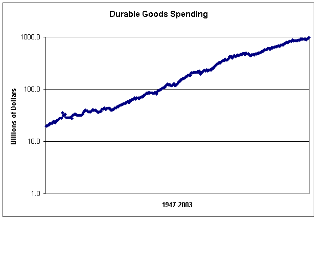
Durable Goods in Log Scale, Chart Realities
Here?s a good e-mail question about yesterday?s durable goods chart. Question: In today's Strategic Insider your consumption chart, PCDG_Max.bmp, goes from 1947 to 2002. You used a linear scale, and consumption appears to be headed for infinity. A long term growth chart needs to be viewed with a log scale.On a log scale it may show realistic normal growth. Can we see it on log scale? Answer: Yes. You can, I think. First, a word on the difference between log and linear. Logarithmic scaling measures changes in value, rather than absolute changes. A log chart will show you a change in percentage terms, while a linear chart shows you just numeric changes. You'd like at a log chart to get a clearer picture of the real change in value in a security. A linear chart, for example, measures vertical difference between 10 and 20 the same as it would measure the difference between 110 and 120, namely 10 units. In percentage terms, of course, the difference between 10 and 20 is a gain of 100%, while the gain between 110 and 120 is only a 9%. Looking at a log chart makes the most sense over time, to give you an idea of the real rate of change in percentage terms. As the alert reader points out, a linear scale shows the y-axis going to the sky. So, assuming I built this Excel chart correctly (and I'm prone to Excel errors now and then), the chart shows a much more gradual pace of consumer spending on durable goods than yesterday's chart. That is, it suggests the pace of consumption grows about the same, I'm assuming, as population and income growth. That's a big assumption, and I'll have to do some more digging. I'd also have to do some more digging to prove what I think the essential point about all this is: even durable goods consumption grows at the same pace as population growth over time, since 1947 that growth has been aided and abetted by installment credit. And while this pace of consumption on credit was sustainable when Americans owed less....average debt levels are now higher. In other words, Americans continue to buy durable goods...along with taking on debt on their homes as well.... Since this log versus linear scale distinction is useful for longer-term numbers, lets take another example, the Nasdaq over the last 10-years. Take a look at the two charts. The top chart is linear scale, the bottom log scale.
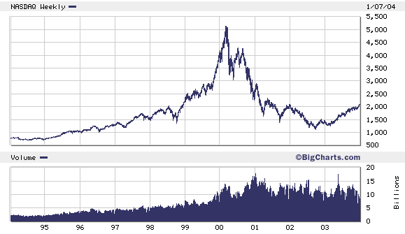
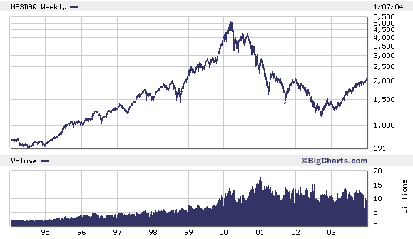 So what do they show us? Well, first, a bubble is still a bubble. But you CAN see the slight difference in that the big gain between 2,500 and 5,000 on the Nasdaq LOOKS even bigger on the linear chart because, after all, it is a LARGER numeric gain that the gain between 500 and 1,000, or 1,000 and 2,000.
In log scale, though, all three gains are 100% gains...and so the slope of the line is more gradual. What's noteworthy about this chart is that even though the log scale shows a more gradual slope...it's STILL a steep slope...indicating unsustainable rate of growth, no matter which way you look at it.
P.S. I checked in Excel for the difference in the log formula versus the linear formula. Here?s what the glossary said.
Linear: Calculates the least squares fit for a line represented by the following equation: y=mx+b, where m is the slope and b is the intercept
Logarithmic:Calculates the least squares fit through points by using the following equation: y= c ln x+b, where c and b are constants, and ln is the natural logarithm function
I?m not sure if I got my log chart built correctly. If you're an Excel expert and can do better, you can find the data set at http://research.stlouisfed.org/fred2/series/PCDG/downloaddata
So what do they show us? Well, first, a bubble is still a bubble. But you CAN see the slight difference in that the big gain between 2,500 and 5,000 on the Nasdaq LOOKS even bigger on the linear chart because, after all, it is a LARGER numeric gain that the gain between 500 and 1,000, or 1,000 and 2,000.
In log scale, though, all three gains are 100% gains...and so the slope of the line is more gradual. What's noteworthy about this chart is that even though the log scale shows a more gradual slope...it's STILL a steep slope...indicating unsustainable rate of growth, no matter which way you look at it.
P.S. I checked in Excel for the difference in the log formula versus the linear formula. Here?s what the glossary said.
Linear: Calculates the least squares fit for a line represented by the following equation: y=mx+b, where m is the slope and b is the intercept
Logarithmic:Calculates the least squares fit through points by using the following equation: y= c ln x+b, where c and b are constants, and ln is the natural logarithm function
I?m not sure if I got my log chart built correctly. If you're an Excel expert and can do better, you can find the data set at http://research.stlouisfed.org/fred2/series/PCDG/downloaddata
posted by Daniel @ 1/08/2004 04:37:00 PM
0 comments
![]()

0 Comments:
Post a Comment
<< Home