Chart of the Day: Ten Year Rates
You may recognize this chart. It's the CBOE Ten year-yield index. As you might guess, it tracks the interest rate on ten year government bonds. This chart goes back ten years, using weekly closes, with a 52-week moving average, which is currently flat, and on which TNX currently sits, poised to move either higher or lower.
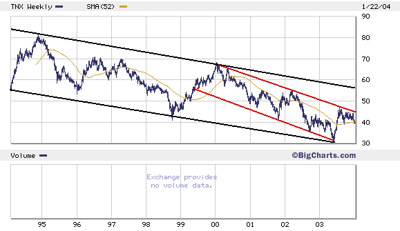 The chart shows you, (1) ten year rates are still in a long-term downward price channel, and (2) within the shorter term price channel since '99, rates have failed to move up and out of the channel toward 5%.
Does this mean rates are more likely to head lower than higher in the next few months? Strange as it sounds if you're as big a dollar bear as I am, the answer is yes. Dollar weakness is bad for stocks, but good for bonds. Of course the chart itself doesn't "say" all that.
But what it DOES indicate is that there is no real upward pressure on interest rates right now. Consumer price inflation--which the Fed has its eye on--is sufficiently tame to be worth ignoring. The only real inflation is going on in the housing and financial asset markets (some people calls this 'inflation.' I call it a bubble). This kind of inflation is a direct result of low interest rates...and furthermore...the Fed and everyone else seems to support it.
In other words, no one really wants rates to go higher. And so the dollar has decoupled from the bond market. The dollar may fall, but bond prices won't. In fact, they may go up, and yields may fall even further....Japan here we come...
The chart shows you, (1) ten year rates are still in a long-term downward price channel, and (2) within the shorter term price channel since '99, rates have failed to move up and out of the channel toward 5%.
Does this mean rates are more likely to head lower than higher in the next few months? Strange as it sounds if you're as big a dollar bear as I am, the answer is yes. Dollar weakness is bad for stocks, but good for bonds. Of course the chart itself doesn't "say" all that.
But what it DOES indicate is that there is no real upward pressure on interest rates right now. Consumer price inflation--which the Fed has its eye on--is sufficiently tame to be worth ignoring. The only real inflation is going on in the housing and financial asset markets (some people calls this 'inflation.' I call it a bubble). This kind of inflation is a direct result of low interest rates...and furthermore...the Fed and everyone else seems to support it.
In other words, no one really wants rates to go higher. And so the dollar has decoupled from the bond market. The dollar may fall, but bond prices won't. In fact, they may go up, and yields may fall even further....Japan here we come...
posted by Daniel @ 1/23/2004 11:28:00 AM
0 comments
![]()

0 Comments:
Post a Comment
<< Home