Charts of the Day: Put Your Bull Markets in Perspective
Tomorrow night I'm headed up to London to have dinner with some fund managers and investment advisors. It's part of my participation in the investor's roundtable sponsored by the London financial magazine "Moneyweek" and its lovely and charming editor, Merryn Somerset Webb. I don't think gold bulls are too welcome right now. But we do make for good entertainment. Today, I got this shot across the bow, "The writings of ultrabears with their persistent prognostications of Armageddon remind me of nothing as much as the old prophets of Marxism who were continually prophesizing that capitalism would would implode under the weight of its own contradictions....Such apocalpytic commentators see bubbles everywhwere and are extremely bearish on everything...The only acceptable investments seem to be (usually) commodities and (invariably) gold." The followed a chart, similar to the one directly below, with the headline, "Spot the Bubble." My version compares Newmont, a proxy for unhedged gold majors, to the Nasdaq. Nasdaq vs. Newmont, weekly close, Jan. 03 to the present
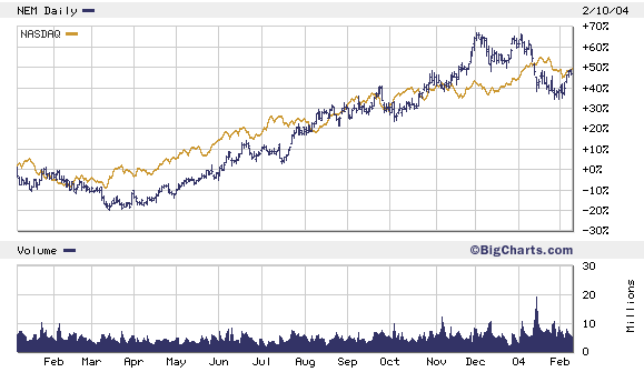 Not so fast, my friend. Let's put our bull (and bear markets) in perspective. Gold is coming off a 20-year bear. It's performance in the last year is the initial stage of what I think is a multi-year bull. Like all stocks, gold stocks can get ahead of earnings. But gold companies are in the business of mining a commodity (and monetary asset) that's increasingly demand. Business is good.
On the other hand, the Nasdaq is the George Foreman of indexes. It's taken some big blows. And though it looks sturdier now than a year ago, it's really just one year older, one year fatter, and one year more bloated. As you can see from the chart below...this is a tale of two bull markets. One that's dead and bouncing...and one that's alive and growing.
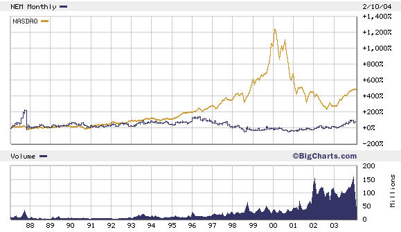
Nasdaq vs. Newmont, 1987 to present
Not so fast, my friend. Let's put our bull (and bear markets) in perspective. Gold is coming off a 20-year bear. It's performance in the last year is the initial stage of what I think is a multi-year bull. Like all stocks, gold stocks can get ahead of earnings. But gold companies are in the business of mining a commodity (and monetary asset) that's increasingly demand. Business is good.
On the other hand, the Nasdaq is the George Foreman of indexes. It's taken some big blows. And though it looks sturdier now than a year ago, it's really just one year older, one year fatter, and one year more bloated. As you can see from the chart below...this is a tale of two bull markets. One that's dead and bouncing...and one that's alive and growing.
Nasdaq vs. Newmont, 1987 to present
posted by Daniel @ 2/11/2004 02:35:00 PM
0 comments
![]()

0 Comments:
Post a Comment
<< Home