Charts of the Day
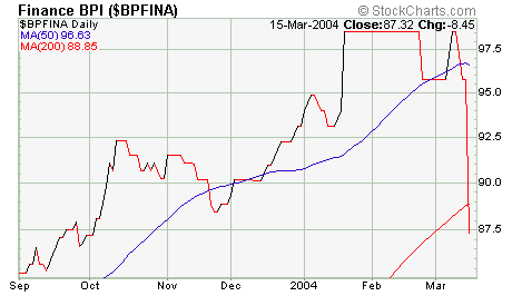
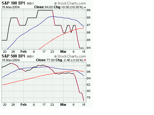
Hat tip to stockcharts.com for great work as always. Below, three bullish percentage charts. The first shows the financial sector. The second, the S&P 100 and 500 respectively. Notice all the moving averages turning down, with the short-term MAs picking up speed. There aren't too many proxies for financial stocks in the ETF world that trade cheaply. There is the Amex broker/dealer index (XBD) that I mentioned last week. The trouble here is that trading is thin and the options are expensive.
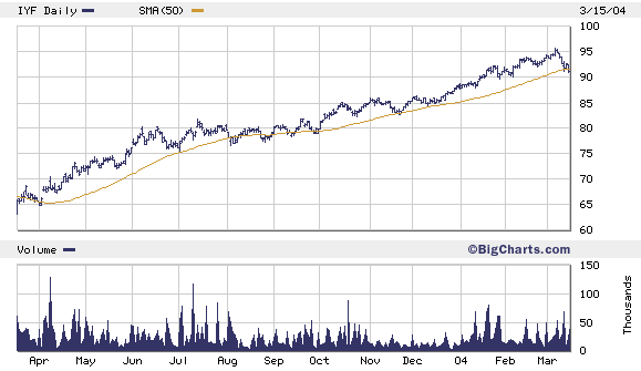
 If you're looking for confirmation that financials and financial services are breaking down....check out the three iShare charts below.
First, IYF, the Dow Jones U.S. Financial Sector Index Fund (38% banks, 21% diversified financials, 20.8% insurance, 11.4% securities brokers, 7.8% real estate.)
If you're looking for confirmation that financials and financial services are breaking down....check out the three iShare charts below.
First, IYF, the Dow Jones U.S. Financial Sector Index Fund (38% banks, 21% diversified financials, 20.8% insurance, 11.4% securities brokers, 7.8% real estate.)
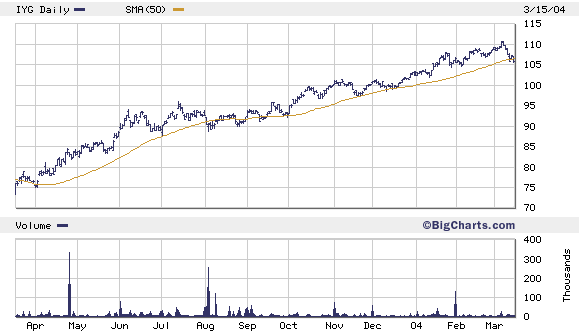
 Next, IYG, the Dow Jones U.S. Financial Services Index Fund (54% banks, 29% diversified financials, 16% securities brokers)
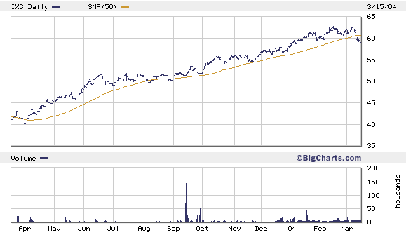
 And finally, IXG, the S&P Global Financials Sector Index Fund (49% banks, 26.9% diversified financials, 19% insurance, and 3.5% real estate.)
 How do you trade it? Right now, XLF and XBD are the only of the indexes shown above that show any significant options activity. Odd that so many ETFs make it possible to trade all sorts of sectors...except financials and broker dealers.
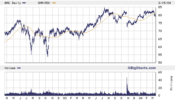
Absent an index or sector put, you can cherry pick and go after the highest flyers. How about Bank of America? It's out $675 million (to be split with its new partner Fleet Boston) for granting high dollar clients the right to do some late trading in mutual funds. Is that priced into the stock? Is a slow-down in mortgage lending? Is a surge in credit defaults...or derivatives losses...or equity losses?
How do you trade it? Right now, XLF and XBD are the only of the indexes shown above that show any significant options activity. Odd that so many ETFs make it possible to trade all sorts of sectors...except financials and broker dealers.
Absent an index or sector put, you can cherry pick and go after the highest flyers. How about Bank of America? It's out $675 million (to be split with its new partner Fleet Boston) for granting high dollar clients the right to do some late trading in mutual funds. Is that priced into the stock? Is a slow-down in mortgage lending? Is a surge in credit defaults...or derivatives losses...or equity losses?
posted by Daniel @ 3/16/2004 12:18:00 PM
0 comments
![]()

0 Comments:
Post a Comment
<< Home