Wages and Inflation: Charts of the Day
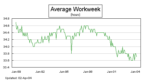
Dear Reader, back from the wildnerness and back on the blog beat. Let's hope I'll have less trouble staying in touch from Asia than I did in America. Quite a bit has happened since I last wrote to you. But instead of reviewing what has happened, let me first bring your attention to what's about to happen. The non-farm payrolls report comes out on Friday. Recall that it was the March report, with it's gain of 308,000 jobs, that sent the market into a tizzy and raised the specter of a rate hike by the Fed. Since then, the Fed has stood pat (evidence yesterday's meeting). But the bond market has pushed long-rates up. And the entire reflation rally that began last year ended quite suddenly. It was an equal opportunity distribution of punishment. No sector or asset class was spared. Such is the nature of the end of bubbles. And it's not over yet. But I do think we'll begin to see a divergence in asset classes, with commodities and precious metals finding some stability, while equities in general get rocked. I've written more about that in my weekly SI report. In this space, a couple of images that bring home the Fed's big problem and it's bigger failure. First is the average work week. You can see that it's been in a downward trend since 1998. Is this just workers being more productive in less time? Or the fact that there are more part time and retail trade jobs in the economy? I think it's the latter. More jobs but at lower wages and fewer hours.
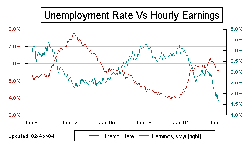
 The next chart is the smoking-gun of the current economic crime scene. It shows average hourly wages not keeping up with inflation. This is the error in the Fed's strategic thinking, that wholesale and producer price increases can be passed on to a consumer who's wages are growing, on average, at less than the rate of inflation.
posted by Daniel @ 5/05/2004 02:09:00 PM
0 comments
![]()

0 Comments:
Post a Comment
<< Home