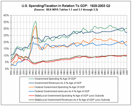
Government Spending and Revenues as a % of GDP Over Time
Mucking my way through IMF and Federal Reserve data....I found a chart put together by Daniel Schmelzer at Carried Away, another blog (there are tons of interesting blogs out there.) The chart shows that total government spending as a % of GDP has been fairly constant since the Depression...but that it's rising recently....


0 Comments:
Post a Comment
<< Home