Chart of the Day
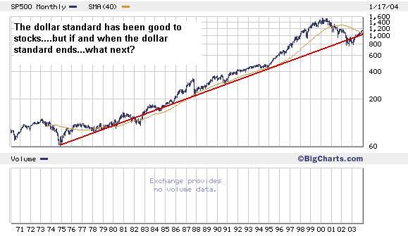
Headed over to London in a few hours for the first of a monthly roundtable meeting with investors and some money managers over there. I'll let you know how it goes... For now...here's a sneak preview at a chart you'll see in the February issue of SI. It's a 30-year chart of the S&P on a monthly-close basis, with a 40-month moving average. I've done in logarithmic scale rather than linear scale to give a better picture of the slope of the S&P's advance over the last three decades. What does it tell you? I won't give away all my analysis....and truth be told I haven't found a chart than runs back before this to see if the slope of the last 30 years is different than the the 30 years before IT...but...the S&P's rise correlates nicely with the end of the gold-standard and the closing of the gold window...it's probably not by accident that the end of the gold standard launched the era of hyper inflation...both in commodities AND in financial assets....
posted by Daniel @ 1/19/2004 10:03:00 AM
0 comments
![]()

0 Comments:
Post a Comment
<< Home